
Business intelligence reporting is the systematic process of transforming raw business data into structured, meaningful reports that help organizations make faster, better-informed decisions. At its core, BI reporting encompasses preparing and analyzing data and presenting it through charts, tables, and interactive dashboards that stakeholders can use. The discipline combines data engineering and communication to tell a clear story that drives action, beyond merely presenting numbers.
What separates effective BI reporting from a pile of spreadsheets comes down to three things: clarity, relevance, and timing. A well-built BI report delivers the right metric to the right person at the right moment, whether that is a weekly sales summary for a regional manager or a real-time operations dashboard for a logistics team. ChristianSteven Software automates this workflow to ensure reports are generated, formatted, and delivered without manual intervention.
Key capabilities that define modern BI reporting:
- Data preparation: Cleaning, transforming, and consolidating data from multiple sources into a reliable foundation
- Analysis: Applying statistical measures, KPIs, and trend detection to surface meaningful patterns
- Visualization: Rendering findings through charts, graphs, and dashboards using recognized standards like ISO 24896:2026, the first international standard for visual notation in business reports
- Dissemination: Delivering finished reports to stakeholders in the right format, on schedule
- Iteration: Updating reports as business conditions and data sources evolve
Table of Contents
- How business intelligence reporting works inside an organization
- Which BI reporting tools are most widely used?
- What are the main types of business intelligence reports?
- Why effective BI reporting matters for your organization
- Best practices for building BI reports that people actually use
- Challenges and limitations of BI reporting
- Security and privacy considerations in BI reporting
- Where is BI reporting headed in the next few years?
- Key Takeaways
- FAQ
How business intelligence reporting works inside an organization
BI reporting is not a one-time project. It is a cyclical process that begins with identifying what a specific audience needs to know, then moves through data preparation, analysis, visualization, and delivery before looping back to reassess whether the report still answers the right questions.
The workflow typically starts at the data layer. Raw data flows from source systems (CRMs, ERPs, transactional databases) into a data warehouse or data lake, where it is cleaned and modeled. From there, a BI platform queries that prepared data and renders it as a report or dashboard. Governance frameworks define who can access which data, what metrics mean, and how they are calculated, preventing the "which number is right?" arguments that derail executive meetings.

Pro Tip: Set up a governed data catalog before you build your first report. Organizations that skip this step often end up with conflicting metric definitions across departments, which undermines report reliability and erodes trust in the entire BI program.
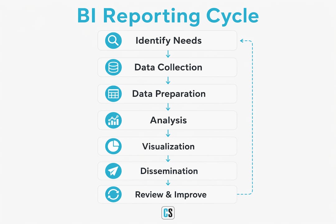
One distinction worth understanding early: reports and dashboards serve different purposes. A report tends to be a static document used for governance reviews or period-end summaries. A dashboard is dynamic, with drill-down filters, automated data refreshes, and real-time monitoring capabilities. Most modern BI programs need both.
| Stage | Primary Activity | Output |
|---|---|---|
| Data preparation | Extract, clean, and model source data | Reliable data layer |
| Analysis | Apply KPIs, statistical measures, trend detection | Insights and findings |
| Visualization | Build charts, tables, dashboards | Reports and dashboards |
| Dissemination | Schedule and deliver to stakeholders | Distributed reports |
| Iteration | Review relevance, update metrics | Refined reporting cycle |
Which BI reporting tools are most widely used?
Choosing a BI platform shapes everything downstream: how reports are built, how users interact with data, and how easily the organization can scale. The tools below represent platforms widely deployed across many U.S. enterprises.
-
Microsoft Power BI: The most widely adopted platform in the Microsoft ecosystem. Power BI connects natively to Azure, SQL Server, and the full Microsoft 365 stack, making it a natural fit for organizations already running on Microsoft infrastructure. Its self-service analytics layer lets business users build reports without writing DAX from scratch, though complex models still benefit from a data engineer's involvement.
-
Tableau: Known for its visualization depth and flexibility. Tableau's drag-and-drop interface makes it accessible to analysts who want to explore data visually, and its calculated fields give experienced users significant analytical power. It integrates with a broad range of data sources and is particularly strong in ad hoc exploration.
-
Qlik: Qlik's associative engine is its defining feature. Rather than querying data along a fixed path, Qlik dynamically recalculates the entire data model as a user interacts with it, surfacing relationships that a traditional query-based tool would miss. This makes it especially effective for exploratory analysis.
-
Domo: A cloud-native platform built for business users who need live data without IT involvement. Domo's strength is its pre-built connector library and its mobile-first design, which suits executives who need dashboard access on the go.
-
Board: Board combines BI reporting with planning and performance management in a single platform. Organizations that want to run financial consolidation, budgeting, and operational reporting from one tool often gravitate toward Board rather than stitching together separate products.
For teams that need to automate report scheduling and delivery across these platforms, choosing the right BI reporting software involves evaluating not just the visualization layer but the entire distribution workflow.
| Tool | Primary Strength | Best Fit |
|---|---|---|
| Microsoft Power BI | Microsoft ecosystem integration | Organizations on Azure or Microsoft 365 |
| Tableau | Visualization depth and flexibility | Analysts doing exploratory work |
| Qlik | Associative data engine | Complex, multi-path data exploration |
| Domo | Cloud-native, mobile-first dashboards | Business users needing live data access |
| Board | BI plus planning in one platform | Finance-led reporting and consolidation |
What are the main types of business intelligence reports?
BI reports are not all built for the same purpose. The four analytical types reflect how deeply a report engages with data, from describing what happened to recommending what to do next.
By analytical depth:
- Descriptive reports answer "what happened?" They summarize historical data, such as monthly revenue by region or quarterly headcount changes. Most standard business reports fall here.
- Diagnostic reports answer "why did it happen?" They drill into the factors behind a result, for example, identifying that a sales dip in Q3 correlated with a pricing change in a specific product line.
- Predictive reports answer "what is likely to happen?" Using statistical models and historical patterns, they forecast future outcomes like demand, churn, or revenue.
- Prescriptive reports answer "what should we do?" They combine predictive modeling with optimization logic to recommend specific actions, such as adjusting inventory levels before a seasonal spike.
By operational scope:
- Operational reports track day-to-day performance metrics: order fulfillment rates, call center volumes, production output. They are typically high-frequency and narrow in scope.
- Strategic reports support long-range planning. They aggregate data across longer time horizons and broader business units, giving executives the view they need for annual planning or market expansion decisions.
- Real-time dashboards sit outside the traditional report category but serve a critical monitoring function. Unlike a static report generated at month-end, a real-time dashboard reflects current conditions and triggers alerts when KPIs breach defined thresholds.
Why effective BI reporting matters for your organization
The clearest benefit of well-executed BI reporting is faster, more confident decision-making. When a leadership team can pull up a single, trusted dashboard instead of reconciling three different spreadsheets from three different departments, meeting time drops and decisions improve.

Beyond speed, BI reporting shifts organizational culture. Teams that see their work reflected in clear, consistent metrics tend to engage more directly with performance data. That shift from gut-feel to evidence-based decisions compounds over time, particularly in sales, operations, and finance.
Standardized visualizations reduce misinterpretation. ISO 24896:2026 addresses this directly by establishing consistent notation for axis scales, color coding, variance indicators, and labels across business reports. When every chart in an organization follows the same visual grammar, stakeholders spend less time decoding what they are looking at and more time acting on what it says.
Key benefits of effective BI reporting:
- Faster decisions: Consolidated, trusted data eliminates the time spent hunting for numbers
- Operational efficiency: Identifying bottlenecks through regular reporting creates clear improvement targets
- Improved collaboration: Shared dashboards align teams around the same metrics and goals
- Reduced misinterpretation: Standardized visuals and governed definitions keep everyone reading the same story
- Data-driven culture: Consistent reporting builds the habit of checking data before acting
Best practices for building BI reports that people actually use
The most common failure in BI reporting is building reports for the builder, not the audience. Before writing a single query, identify exactly who will read the report, what decision it supports, and how often they need it updated. A CFO reviewing monthly P&L needs something different from a warehouse supervisor checking daily throughput.
Data governance is the foundation. Without a single, agreed-upon definition for each metric, reports from different teams will contradict each other. Implementing a governed data catalog early, one that defines access rules and metric calculations, prevents the credibility problems that kill BI programs before they gain traction.
Pro Tip: Design reports using modular components: reusable chart templates, shared calculated fields, and standardized data models. This approach, recommended by the Standard Business Report Model, reduces technical debt and makes updates far less painful when source systems change.
Additional practices that separate reliable BI programs from fragile ones:
- Align visuals with ISO 24896:2026: Consistent notation across reports reduces the cognitive load on stakeholders who read multiple reports regularly
- Balance simplicity with completeness: Stripping a report down to three KPIs is clean, but only if those three KPIs actually capture the insight the audience needs
- Enable self-service where appropriate: Platforms that let analysts explore data freely without IT tickets increase productivity and reduce the reporting backlog
- Schedule iterative reviews: Business conditions change; a report built for last year's org structure may be actively misleading today
Challenges and limitations of BI reporting
BI reporting delivers real value, but it comes with friction that organizations consistently underestimate. Data quality is the most common culprit. A report is only as trustworthy as the data feeding it, and most organizations discover mid-project that their source systems contain duplicates, gaps, or inconsistent field definitions that require significant cleanup before any analysis is possible.
Non-technical users often struggle to validate results. When a dashboard shows an unexpected number, most business users cannot trace it back through the data model to confirm whether it reflects reality or a calculation error. That gap between the report and its underlying logic creates hesitation, and hesitation slows the decision-making that BI reporting is supposed to accelerate.
Keeping reports current is resource-intensive. Data must be continuously updated, pipelines must be maintained, and reports must be revised as business processes change. Organizations that treat BI reporting as a one-time build rather than an ongoing program typically find their dashboards drifting out of relevance within months. Cloud-based deployment strategies can reduce some of this maintenance burden, particularly for teams managing scalable BI infrastructure across distributed environments.
Security and privacy considerations in BI reporting
BI reports often contain some of the most sensitive data in an organization: revenue figures, employee records, customer information, and competitive metrics. Access control is the first line of defense. Role-based permissions ensure that a regional sales manager sees only their territory's data, not the full enterprise view reserved for the C-suite.
Data governance frameworks, beyond their role in metric consistency, also define who can export, share, or modify reports. Without these controls, a well-intentioned analyst can inadvertently distribute a report containing personally identifiable information to an audience that should not have it. The State of Oklahoma's enterprise BI standard explicitly requires that analytics data be staged in secure cloud environments and that reports be deployed to centrally governed platforms to maintain compliance.
SOC 2 Type II certification is the benchmark most enterprises use when evaluating BI automation vendors. It confirms that a vendor's security controls have been independently audited over an extended period, not just assessed at a point in time. ChristianSteven Software holds SOC 2 Type II certification, which matters when BI reports are being automatically generated and distributed across an organization at scale. Integrating BI tools with existing data infrastructure requires careful attention to governance and management to keep sensitive data protected throughout the reporting pipeline.
Where is BI reporting headed in the next few years?
The clearest trend is the convergence of traditional static reporting and interactive BI into unified platforms. Organizations increasingly expect a single tool to handle both the monthly governance report and the real-time drill-down dashboard, and the divide between the two is closing fast. Vendors are responding by building flexible engines that serve both use cases without requiring separate products.
AI-assisted analysis is moving from experimental to standard. Augmented analytics features, where the platform automatically surfaces anomalies, suggests visualizations, or narrates findings in plain language, are now appearing across major BI platforms. This reduces the barrier for non-technical users and accelerates the time from raw data to decision.
The adoption of ISO 24896:2026 signals a broader push toward semantic visual standards. As more organizations align their reports to a common visual grammar, cross-functional and cross-organizational reporting becomes easier to interpret without training. Automation is also deepening: tools like ChristianSteven Software's PBRS for Power BI and ATRS for Tableau Reports handle the scheduling, formatting, and delivery of reports automatically, freeing analysts to focus on interpretation rather than distribution. See ATRS in action through these demo videos to understand what fully automated report delivery looks like in practice.
Key Takeaways
Effective BI reporting converts raw data into trusted, timely insights that drive faster decisions across every level of an organization.
| Point | Details |
|---|---|
| BI reporting is cyclical | It requires continuous iteration as business needs and data sources evolve, not a one-time build. |
| Governance prevents metric conflicts | A governed data catalog with defined access and calculations is the foundation of trustworthy reports. |
| Report types serve different purposes | Descriptive, diagnostic, predictive, and prescriptive reports each answer a different business question. |
| ISO 24896:2026 reduces misinterpretation | Standardized visual notation for charts and labels cuts the time stakeholders spend decoding reports. |
| Automation closes the delivery gap | Platforms like ChristianSteven Software handle scheduling and distribution so analysts focus on insights. |
FAQ
What is business intelligence reporting?
Business intelligence reporting is the process of collecting, analyzing, and visualizing business data to support informed decision-making. It produces structured outputs, from static period-end reports to interactive real-time dashboards, that help organizations track KPIs and act on data.
What are the four main types of BI reports?
The four types are descriptive (what happened), diagnostic (why it happened), predictive (what is likely to happen), and prescriptive (what action to take). Each reflects a different level of analytical depth and serves a different decision-making context.
What does a business intelligence report look like?
A BI report typically combines charts, tables, and summary text organized around specific KPIs. Interactive versions include filters, drill-down capabilities, and automated data refreshes, while static versions are formatted documents distributed on a set schedule.
What are the five stages of business intelligence?
BI programs generally move through data collection, data preparation, analysis, visualization, and dissemination. The process is iterative: after dissemination, teams reassess whether the reports still answer the right questions and update accordingly.
What are the four types of operational reporting?
Operational reports commonly fall into four categories: status reports (current state of a process), exception reports (flagging deviations from targets), trend reports (performance over time), and detail reports (granular transaction-level data). Each serves a different monitoring or management need.