
A modern real-time KPI dashboard should combine live data connections, focused KPI scorecards, and threshold alerts so your team can act on what's happening now, not what happened yesterday. Three reasons this matters in practice:
- Speed to decision: When a metric crosses a threshold, the right person gets an alert within seconds, not during the next scheduled report run.
- Centralized visibility: Every function, from ops to finance to IT, reads from the same live canvas instead of reconciling stale spreadsheet exports.
- Reduced mean-time-to-detect: Incidents, campaign underperformance, and SLA breaches surface faster, which cuts the window between problem and response.
For enterprise teams running on-premises BI environments, ChristianSteven Software's products cover the full stack: IntelliFront BI for live KPI delivery, PBRS for Power BI automation, ATRS for Tableau scheduling, and CRD for Crystal Reports.
Key Takeaways
Real-time KPI dashboards deliver their full value only when latency is matched to the actual decision window, KPI definitions are documented and governed, and alerts are tuned to avoid noise.
| Point | Details |
|---|---|
| Match latency to your process | Sub-second streaming is for incident response; 5–15 minute polling covers most campaign and ops use cases. |
| Limit the primary view | Cap the main dashboard at 5–7 KPIs and move lower-priority signals to drill-downs or scheduled reports. |
| Document every metric | Each KPI needs a definition, formula, data source, owner, and alert threshold before going live. |
| Govern before you scale | Assign metric owners, enforce change control, and gate new KPI additions behind a review process. |
| ChristianSteven Software | IntelliFront BI, PBRS, ATRS, and CRD cover live KPI delivery and BI automation for on-premises Power BI, Tableau, SSRS, and Crystal Reports environments with SOC 2 Type II certification. |
Table of Contents
- What are real-time KPI dashboards, and how do they differ from scheduled reports?
- Why do teams adopt live performance dashboards?
- What core features should a modern real-time KPI dashboard have?
- How do real-time updates actually work?
- How do you build or deploy a real-time KPI dashboard?
- Real-world dashboard examples and KPI templates by function
- What governance and KPI selection practices build trust in your dashboards?
- How ChristianSteven Software supports real-time KPI dashboards
- When real-time dashboards are worth the complexity, and when they are not
- ChristianSteven Software fits teams that need enterprise-grade BI automation
- Sources
- FAQ
What are real-time KPI dashboards, and how do they differ from scheduled reports?
A real-time KPI dashboard is a live-updating monitoring canvas that pulls or streams fresh metric values from connected data sources without requiring a manual refresh. The term "real-time" covers a spectrum of latency, and the right tier depends on what your business process actually demands:
- Sub-second to 5 seconds: Site reliability, trading systems, and active incident response. Any delay here means missed alerts.
- 30 seconds to 2 minutes: E-commerce checkout funnels, call center queues, and manufacturing line throughput. You need near-current data, but millisecond precision is unnecessary.
- 5 to 15 minutes: Campaign performance, hourly sales pacing, and logistics tracking. Frequent enough to catch drift before it compounds.
The key distinction from scheduled or snapshot dashboards is the data connection model. A scheduled report queries a database at fixed intervals, renders a static view, and delivers it. A real-time dashboard maintains a persistent or frequently polled connection to live sources, including REST APIs, webhooks, change-data-capture (CDC) streams, and event streaming systems. Values update continuously, so the dashboard reflects the current state of the business rather than its state at the last export.
That distinction matters most when the cost of a delayed signal is high. A DevOps team watching error rates needs seconds-level data. A CFO reviewing monthly revenue pacing is fine with an hourly refresh. Matching latency to the actual decision window is the first design choice, and it drives every architecture decision that follows.
Why do teams adopt live performance dashboards?
The practical case for real-time monitoring comes down to four operational outcomes:
- Faster incident detection: IT and DevOps teams catch error rate spikes, latency degradation, and capacity issues before users report them.
- Live campaign optimization: Marketing teams see conversion rates and cost-per-acquisition shift in near real time, so budget reallocation happens during a campaign, not after the post-mortem.
- Operational throughput management: Warehouse and logistics teams monitor queue depth and fulfillment rates against targets, adjusting staffing or routing mid-shift.
- Executive visibility without the meeting: Leadership sees current pipeline, revenue pacing, and SLA status on a single canvas instead of waiting for a weekly deck.
Short use-case examples by function:
- Marketing: A live dashboard showing conversion rate by channel and cost per acquisition lets a paid media team pause an underperforming ad set within the hour, not the next morning.
- Sales: Pipeline velocity and bookings-to-date against quota give sales managers a daily read on whether the team is on track, with no manual CRM export required.
- Operations: Throughput and queue depth metrics flag bottlenecks in real time, enabling supervisors to redeploy resources before a backlog builds.
- IT/DevOps: Error rate, latency, and uptime metrics on a live dashboard reduce mean-time-to-detect and mean-time-to-resolve for production incidents.
- Customer support: Tickets-in-queue and CSAT scores update continuously, so team leads can redistribute workload before SLA breach windows close.
Each of these scenarios ties back to a measurable outcome: reduced downtime, faster triage, better campaign ROI, or fewer SLA penalties. The dashboard itself is not the goal; the shortened response window is.
What core features should a modern real-time KPI dashboard have?
The feature set that separates a genuinely useful live dashboard from a pretty chart collection is narrower than most vendor marketing suggests. Focus on these:
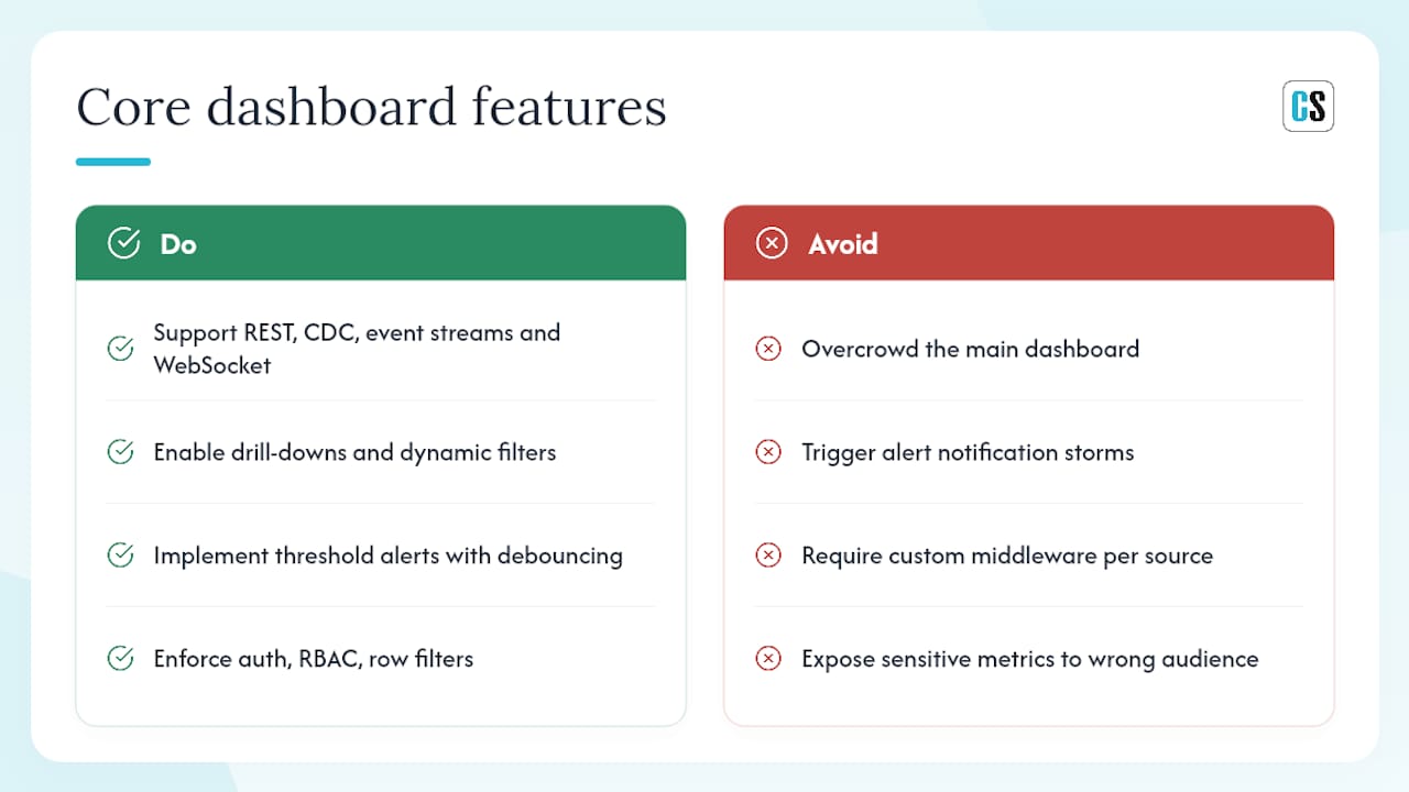
Live data connectors are the foundation. The platform must support REST APIs, CDC-enabled databases, and event streaming systems without requiring custom middleware for every new source. WebSocket support or a managed push gateway is required for sub-minute latency; polling-based connectors are acceptable for 5-minute-plus refresh windows.
Drill-downs and dynamic filters let users move from a summary KPI to the underlying detail without leaving the dashboard. A sales manager who sees pipeline velocity drop should be able to click through to the deals driving the change, filtered by region or rep, in the same view.
Threshold alerts are where live dashboards earn their keep. The alert should fire when a metric crosses a defined boundary, route to the right channel (Slack, email, or webhook), and include enough context (current value, threshold, time of breach) to act without opening the dashboard. Alert debouncing matters here: a metric that oscillates around a threshold should not generate a notification storm. Set a minimum duration or a hysteresis band so alerts fire only on sustained breaches.
Security and governance controls are non-negotiable for enterprise deployments. Authentication for data streams (OAuth, API keys, or service accounts), role-based access to specific KPI tiles, and row-level data filtering at the source prevent sensitive metrics from reaching the wrong audience.
Pro Tip: Limit the primary dashboard view to a small number of KPIs. According to KPI dashboard best practices, overcrowding is the most common reason dashboards stop getting used. Move lower-priority signals to drill-down views or scheduled reports, and reserve the main canvas for the metrics that trigger action.
For chart type guidance, Spider Strategies' KPI dashboard resource is a practical reference: sparklines for trends, gauges for target-vs-actual, and heatmaps for distribution across time or category.
How do real-time updates actually work?
The architecture pattern you choose determines latency, infrastructure cost, and operational complexity. Three main patterns cover most enterprise scenarios:
Push-based streaming uses an event broker (Apache Kafka is the most common enterprise choice) or a WebSocket server to push metric updates to the dashboard client the moment they are available. Latency is sub-second to a few seconds. Open-source implementations using React/Recharts on the frontend and Node.js or FastAPI on the backend demonstrate this pattern well, including buffering, auto-reconnect logic, and lightweight server-side broadcasting for multiple concurrent clients.
Server-sent events (SSE) offer a simpler push model over standard HTTP. The server streams updates to the browser over a persistent connection. SSE is unidirectional (server to client only), which makes it easier to secure and scale than full-duplex WebSockets, and it is a good fit for dashboards where the client never needs to send data back.
Client-side polling has the client request fresh data on a fixed interval (every 30 seconds, every minute). It is the simplest pattern to implement and works well for 5-minute-plus refresh windows, but it adds unnecessary load at high frequency and cannot achieve sub-minute latency reliably.
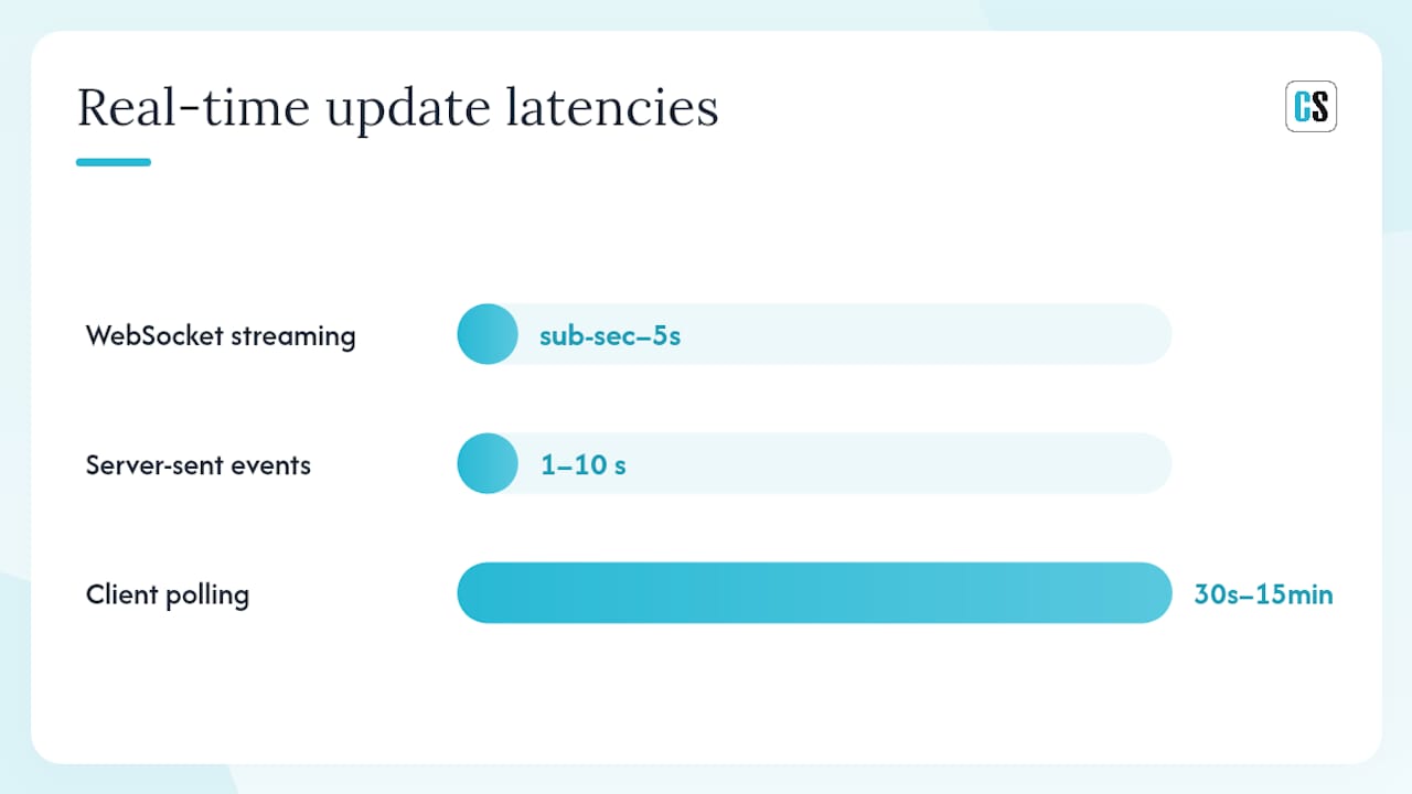
| Pattern | Typical latency | Complexity | Best fit |
|---|---|---|---|
| WebSocket streaming | Sub-second to 5s | High | Incident monitoring, trading, ops floors |
| Server-sent events | 1–10 seconds | Medium | One-way metric feeds, executive dashboards |
| Client polling | 30s–15 min | Low | Campaign dashboards, hourly KPI pacing |
Scalability note: When managing thousands of concurrent live viewers, high-performance dashboard implementations recommend connection multiplexing, server-side aggregation before broadcast, and buffer-size tuning to reduce per-client overhead. Auto-reconnect logic on the client side handles intermittent connection drops without user intervention.
Security callouts: Authenticate every stream connection (OAuth 2.0 or signed tokens), encrypt data in transit with TLS, apply rate limiting at the gateway layer, and filter data at the source so clients receive only the rows and columns their role permits. Never expose raw database credentials to the frontend.
How do you build or deploy a real-time KPI dashboard?
A practical implementation follows eight steps. Skipping the early planning steps is the most common reason dashboards get rebuilt six months later.
- Define your KPIs. Write a one-line definition, the calculation formula, the data source, the owner, and the target or threshold for each metric before touching any tooling.
- Identify and vet your data sources. Confirm that each source can support the required refresh cadence. Data-quality practices, including source vetting, documented transformations, and sampling checks, must happen before any live values appear on a dashboard.
- Map refresh needs to architecture. Metrics requiring sub-minute updates need a streaming or WebSocket pattern. Metrics that tolerate 5-minute-plus delays can use polling. Mixing both in one dashboard is fine; just document which tier each KPI sits in.
- Design the data model. Decide whether you are querying a pre-aggregated data mart, a streaming topic, or a live OLTP database. Pre-aggregation reduces query load; streaming topics reduce latency. Most enterprise dashboards use both.
- Prototype visuals. Build a low-fidelity mockup with real (or representative) data before committing to a layout. No-code and low-code builders can accelerate this step significantly, letting teams connect spreadsheets, CRMs, and APIs quickly to validate the design before engineering investment.
- Set alerts and test them. Configure threshold alerts for every KPI that requires action when it breaches. Test alert noise by simulating boundary conditions; adjust debounce settings until the alert volume is manageable.
- Load test connections. Simulate peak concurrent users and peak data volume before go-live. Reference implementations document update intervals, history buffer sizes, and performance tuning details that apply directly to production deployments.
- Onboard users with documentation. Every dashboard should ship with a glossary entry for each KPI: definition, formula, data source, owner, and refresh cadence. Embed short definitions as tooltips directly in the UI so users never have to leave the dashboard to understand what they are looking at.
Pilot checklist: Start with one function (IT or ops works well because the feedback loop is fast), limit scope to 5–7 KPIs, measure adoption at 30 days, and iterate before scaling to other teams. A narrow pilot that succeeds builds organizational trust faster than a broad rollout that confuses users.
Real-world dashboard examples and KPI templates by function
These templates give you a starting point. Adapt the thresholds to your own baselines.
Marketing dashboard
Track conversion rate by channel, cost per acquisition, and click-through rate. Sparklines show trend over the last 7 days; a gauge shows current CPA against target. For web-specific KPIs, measuring website success with the right metrics and tools is a practical reference for digital teams building their first marketing dashboard.
Sales dashboard
Pipeline velocity (deals × average deal size × win rate ÷ sales cycle length), bookings-to-date vs. quota, and average days-to-close. A horizontal bar chart comparing rep performance against quota is more readable than a table for this use case.
Operations dashboard
Throughput (units processed per hour), queue depth, and on-time fulfillment rate. Heatmaps work well for queue depth across time of day; a large numeric tile with color-coded status (green/amber/red) works for throughput.
IT/DevOps dashboard
Error rate (errors per minute), p95 latency, and uptime percentage. These are the metrics that benefit most from sub-second streaming. A sparkline for error rate trend plus a large current-value tile with a red threshold indicator is the standard layout.
Customer support dashboard
Tickets in queue, average handle time, and CSAT score. A gauge for CSAT against target and a live count tile for queue depth give team leads the two numbers they need to make staffing decisions in real time.
KPI dashboard examples and best practices provide additional chart-type guidance for matching visual format to KPI intent, whether that is a trend, a distribution, or a point-in-time value.
What governance and KPI selection practices build trust in your dashboards?
A dashboard that people do not trust stops getting used. Governance is what makes the difference between a live canvas that drives decisions and one that gets ignored after the first confusing number appears.
Governance checklist:
- Assign a metric owner for every KPI. This person is responsible for the definition, the data source, and the accuracy of the value.
- Document each KPI in a one-page metadata record: definition, calculation formula (or SQL), data source, refresh cadence, owner, and the threshold that triggers an alert.
- Enforce a change-control process for KPI definitions. When a formula changes, the dashboard must reflect the new definition and the change log must note the date and reason.
- Gate new KPI additions to public dashboards behind a review. This prevents dashboard sprawl and keeps the primary view focused.
- Apply role-based access policies so users see only the metrics relevant to their function.
Pro Tip: Embed short definitions directly in the UI as tooltips on every KPI tile. Nielsen Norman Group's tooltip guidelines recommend placing context exactly where users expect it, which means on the metric label itself, not in a separate help document. Each tooltip should include the formula, the data source, and the owner's name.
Alert hysteresis deserves its own mention. An alert that fires every time a metric briefly crosses a threshold trains teams to ignore alerts. Set a minimum sustained-breach duration (for example, 3 consecutive minutes above threshold) before the alert fires. This single configuration change reduces alert fatigue more than any other setting.
Example glossary fields to capture for each KPI:
- Name: The canonical metric name used everywhere in the organization.
- Definition: One plain-language sentence describing what the metric measures.
- Formula: The exact calculation, including any filters or exclusions.
- Data source: The system of record and the specific table or API endpoint.
- Owner: Name and team of the person responsible for accuracy.
- Refresh cadence: How frequently the value updates.
- Alert threshold: The value that triggers a notification, and the channel it routes to.
How ChristianSteven Software supports real-time KPI dashboards
ChristianSteven Software covers the full range of enterprise on-premises BI automation needs across four products:
- IntelliFront BI handles live KPI delivery, giving teams a real-time dashboard canvas that connects to existing data sources and surfaces threshold-triggered alerts without requiring a cloud migration.
- PBRS automates Power BI report exports, scheduling, and delivery across email, cloud storage, and collaboration tools, including data-driven and event-triggered workflows.
- ATRS does the same for Tableau, handling scheduling, formatting, and delivery so Tableau reports reach the right person in the right format on the right cadence.
- CRD covers Crystal Reports automation for organizations still running Crystal Reports in production environments.
Security and deployment: ChristianSteven Software holds SOC 2 Type II certification, which matters for enterprise buyers who need documented controls for data access, availability, and confidentiality. All products support on-premises and hybrid deployment, so sensitive data never has to leave your infrastructure.
Deployment scenarios:
- Small pilot: Deploy IntelliFront BI against one data source, configure 5–7 KPIs, and run for 30 days with a single team before expanding.
- Mid-market scale: Connect PBRS or ATRS to existing Power BI or Tableau environments, automate scheduled and event-triggered delivery, and add IntelliFront BI for the live monitoring layer.
- Enterprise integration: Use REST API integration to connect ChristianSteven Software products to upstream CDP or event streaming platforms, enabling automated delivery triggered by live data events.
Evaluation checklist for on-premises BI automation buyers:
- Does the platform support your existing BI tools (Power BI, Tableau, SSRS, Crystal Reports)?
- Can it handle both scheduled and event-triggered delivery?
- Does it support on-premises deployment with no mandatory cloud dependency?
- Is SOC 2 Type II certification documented and available for review?
- What alert delivery channels does it support (email, Slack, webhooks)?
For a deeper look at selecting the right KPI dashboard software, ChristianSteven Software's evaluation guide walks through the criteria that matter most for enterprise and mid-market buyers.
When real-time dashboards are worth the complexity, and when they are not
Most organizations over-invest in real-time infrastructure for metrics that do not require it. The honest decision framework is simple: if the cost of a delayed signal exceeds the cost of building and maintaining a streaming architecture, invest in real-time. If it does not, a well-designed scheduled dashboard is the better choice.
The clearest cases for real-time monitoring are processes where the response window is shorter than the reporting interval. An IT team that needs to respond to an error rate spike within 5 minutes cannot wait for an hourly report. A call center managing SLA breach risk in a 15-minute window cannot rely on a daily dashboard. For these teams, the infrastructure investment pays for itself in the first avoided incident.
Scheduled reporting is often the right answer for strategic metrics: monthly revenue, quarterly churn, annual customer lifetime value. These numbers do not change fast enough to justify a streaming architecture, and the governance overhead of maintaining live connections to financial systems is rarely worth it for metrics reviewed once a week.
The middle ground is where teams most often make the wrong call. Before committing to WebSockets and Kafka, ask whether a 10-minute refresh interval would change any decision your team actually makes. For most mid-market teams, the answer is no.
Adoption effort is the other underweighted factor. A technically perfect real-time dashboard that confuses its users reverts to a scheduled report within a month. Invest in documentation, tooltips, and a narrow pilot before scaling. The architecture is the easy part.
ChristianSteven Software fits teams that need enterprise-grade BI automation
Teams that have already invested in Power BI, Tableau, SSRS, or Crystal Reports do not need to replace their BI stack to get real-time KPI delivery. ChristianSteven Software connects directly to those environments, automates the scheduling and delivery layer, and adds live KPI monitoring through IntelliFront BI, all on-premises with SOC 2 Type II security controls in place.
The practical next step is a scoped pilot: pick one BI tool you already use, identify 5–7 KPIs that would benefit from automated delivery or live monitoring, and run a 30-day trial. ChristianSteven Software's products support automated Power BI exports and Tableau report automation out of the box, with no cloud migration required. Schedule a demo to see how the platform fits your existing environment and get a scoped deployment plan from the team.
Sources
- Tooltip guidelines — Nielsen Norman Group
- Data Quality — The Resoluble Journal
- Real-Time Analytics Dashboard (example project) — Ratnakar-Ravada / GitHub
FAQ
What is a real-time KPI?
A real-time KPI is a metric that updates continuously from a live data source, typically within seconds to a few minutes, so teams can monitor current performance rather than historical snapshots.
What are examples of good KPI dashboards?
Strong examples include an IT/DevOps dashboard tracking error rate, p95 latency, and uptime with sub-second streaming; a sales dashboard showing pipeline velocity and bookings-to-date against quota; and a support dashboard displaying live ticket queue depth and CSAT score.
How do you create a real-time dashboard?
Define your KPIs and their data sources first, vet data quality, choose a streaming or polling architecture based on required latency, prototype visuals, configure threshold alerts, and document every metric with a definition, formula, and owner before going live.
What is the best tool for a KPI dashboard in an enterprise on-premises environment?
For teams running Power BI, Tableau, SSRS, or Crystal Reports on-premises, ChristianSteven Software's IntelliFront BI handles live KPI delivery, while PBRS, ATRS, and CRD automate report scheduling and delivery across those platforms with SOC 2 Type II security controls.
How many KPIs should a real-time dashboard show?
Limit the primary view to 5–7 KPIs. Best-practice guidance consistently identifies overcrowding as the leading cause of dashboard abandonment; move lower-priority metrics to drill-down views or scheduled reports.